astier
branding, packaging, illustration, layout, web design
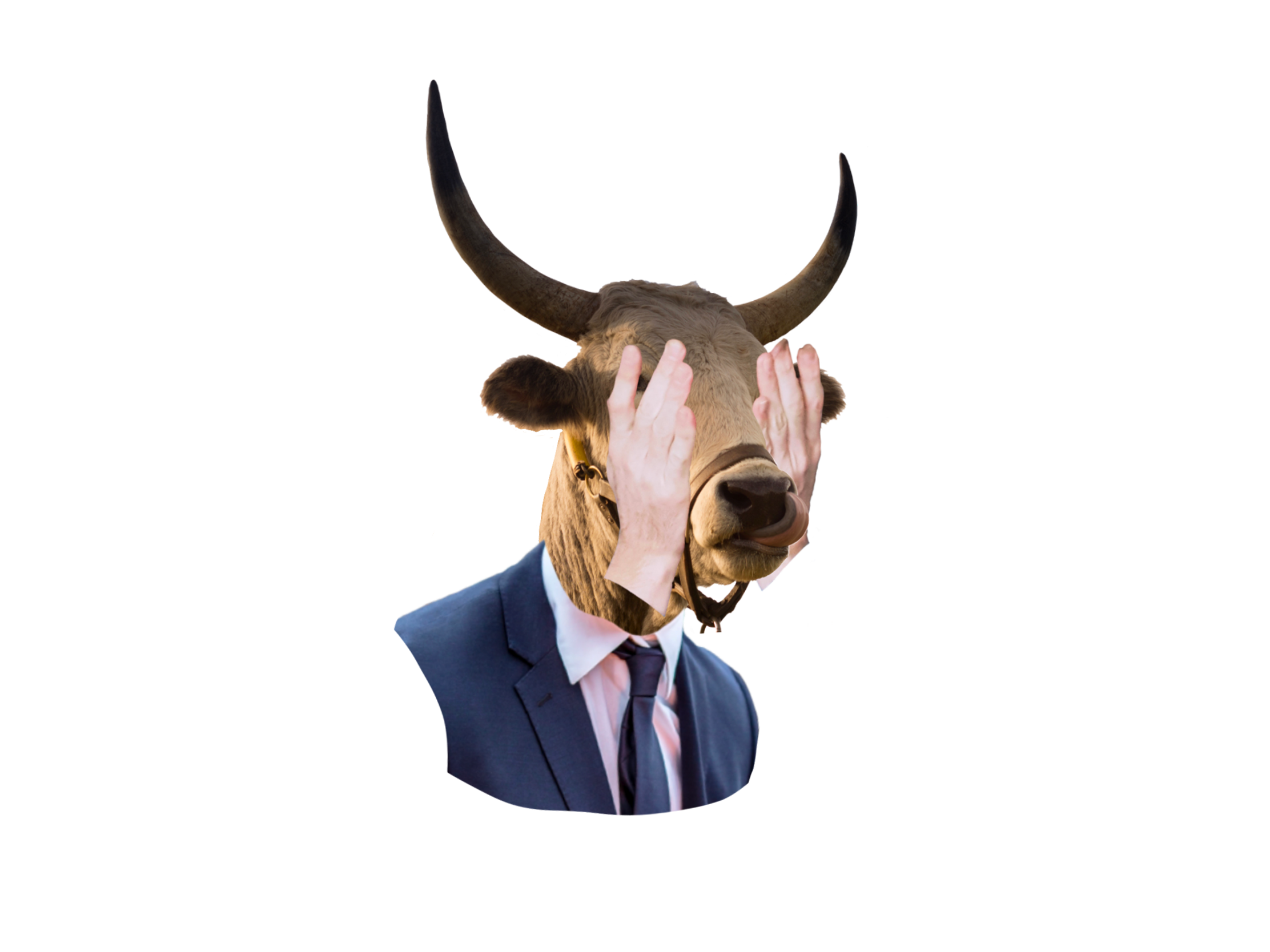
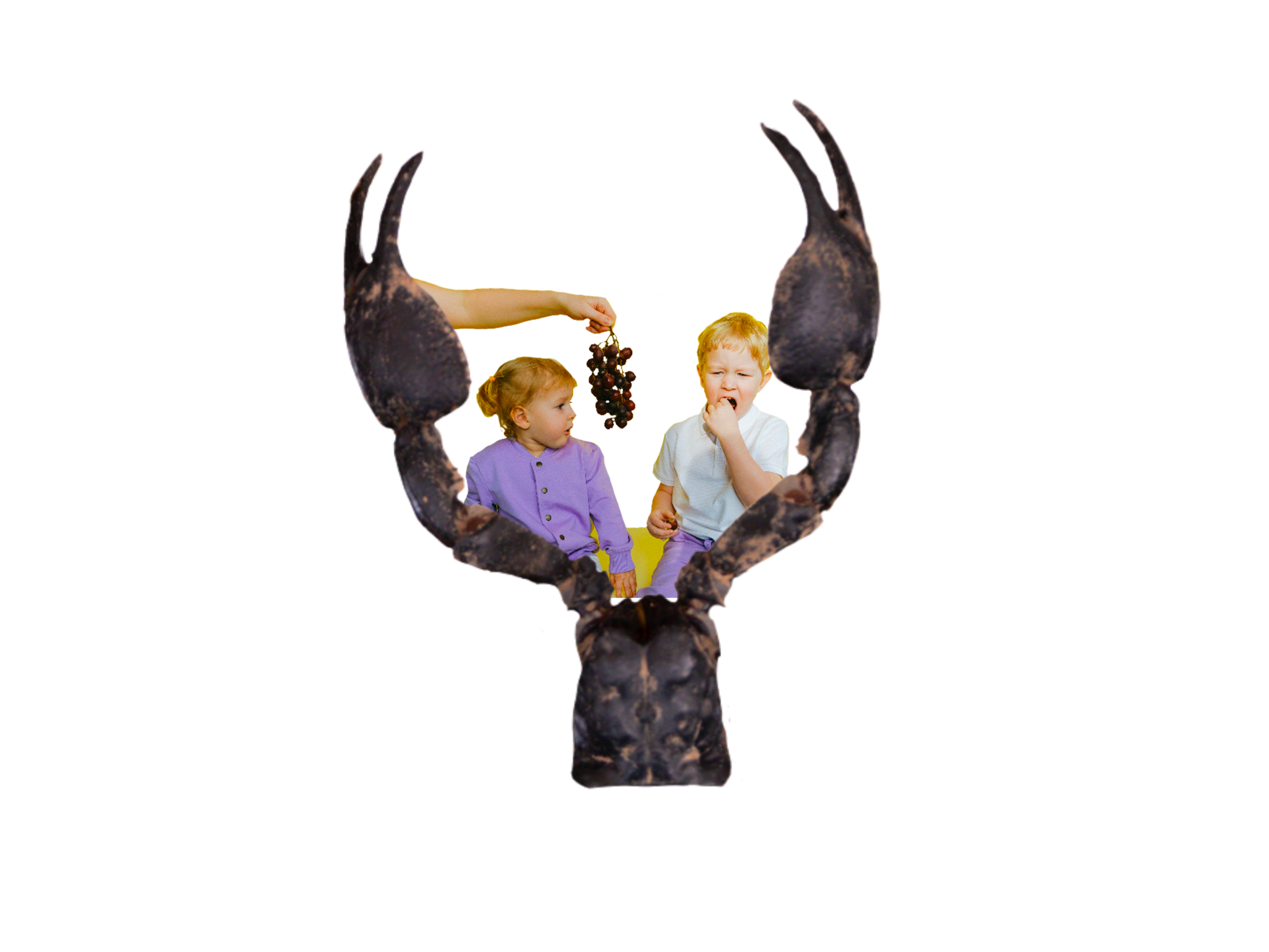
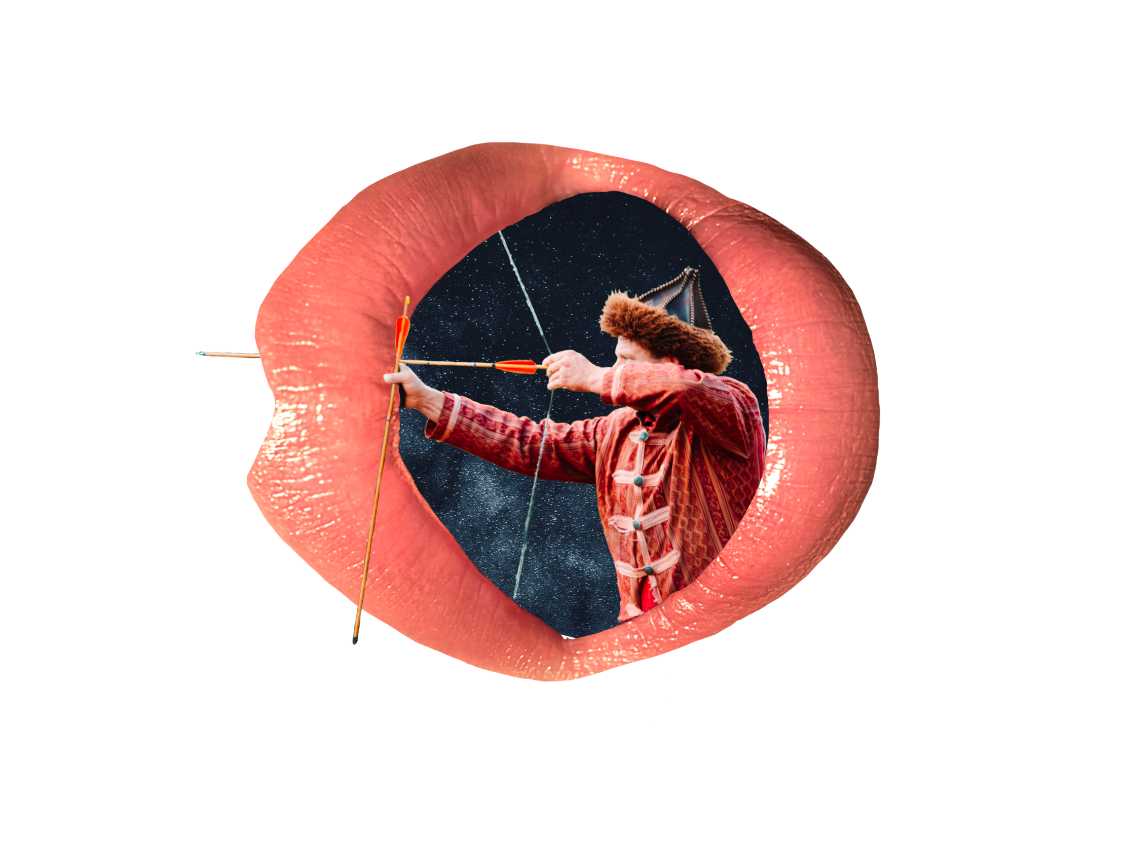
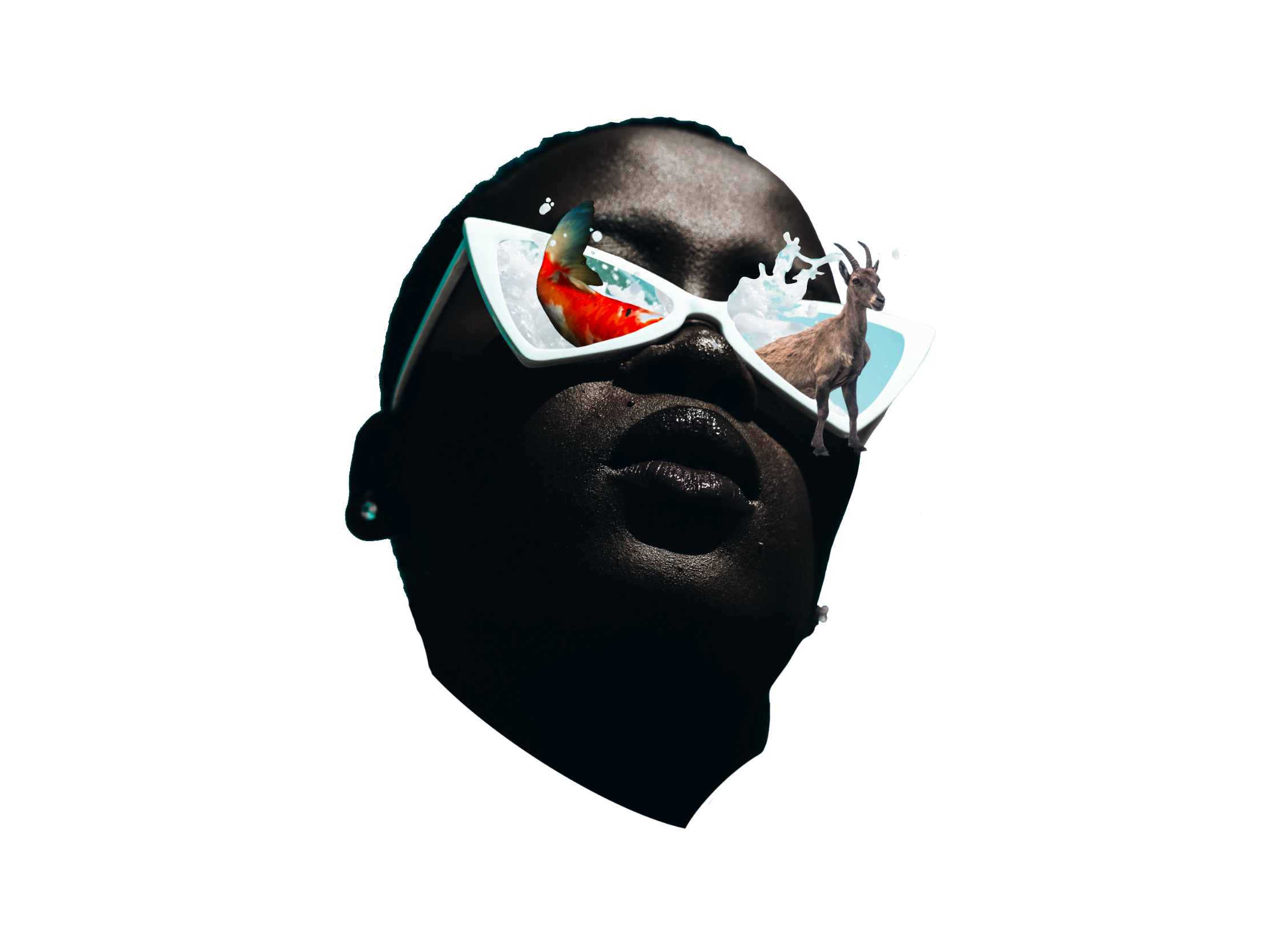
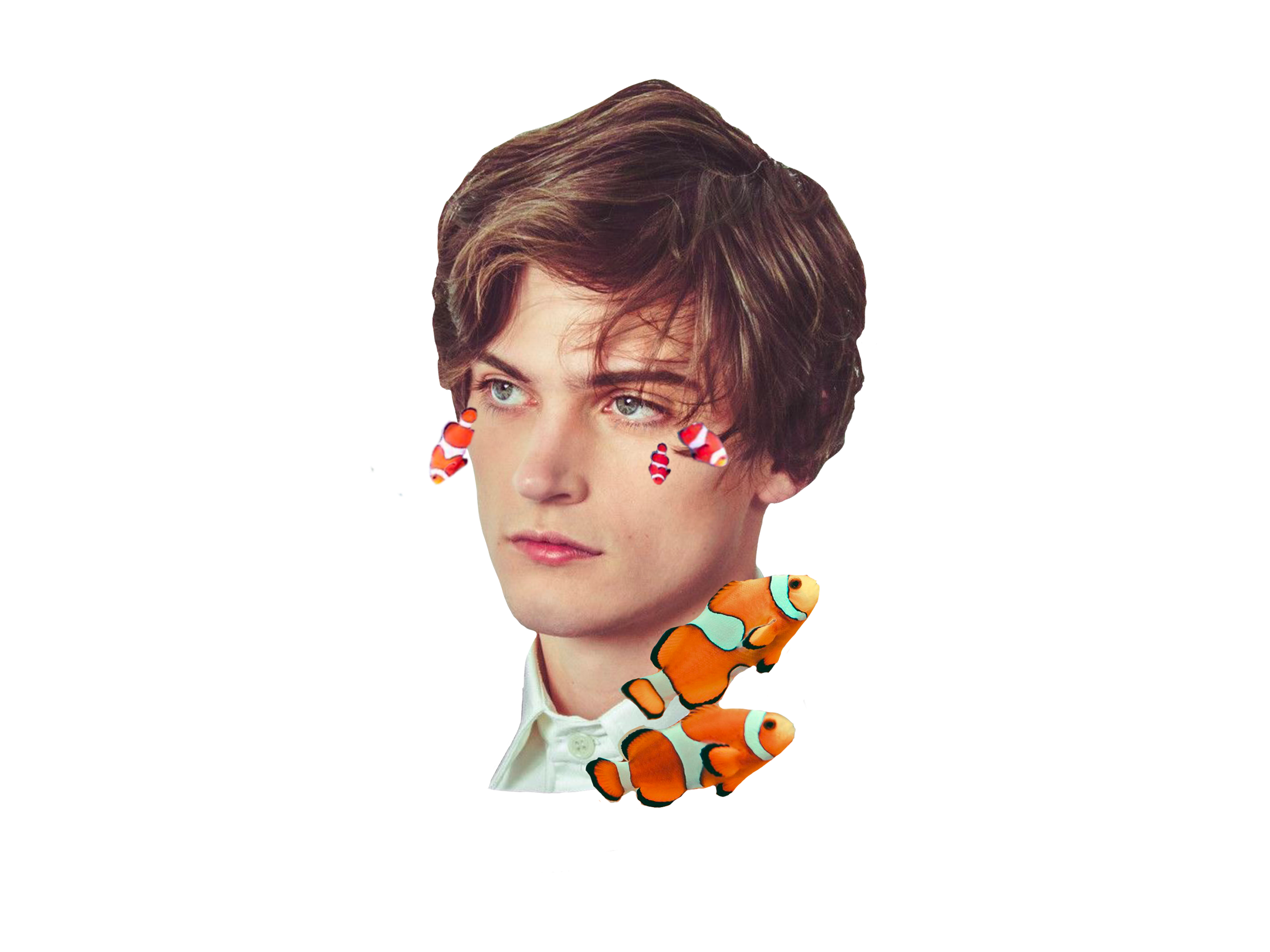
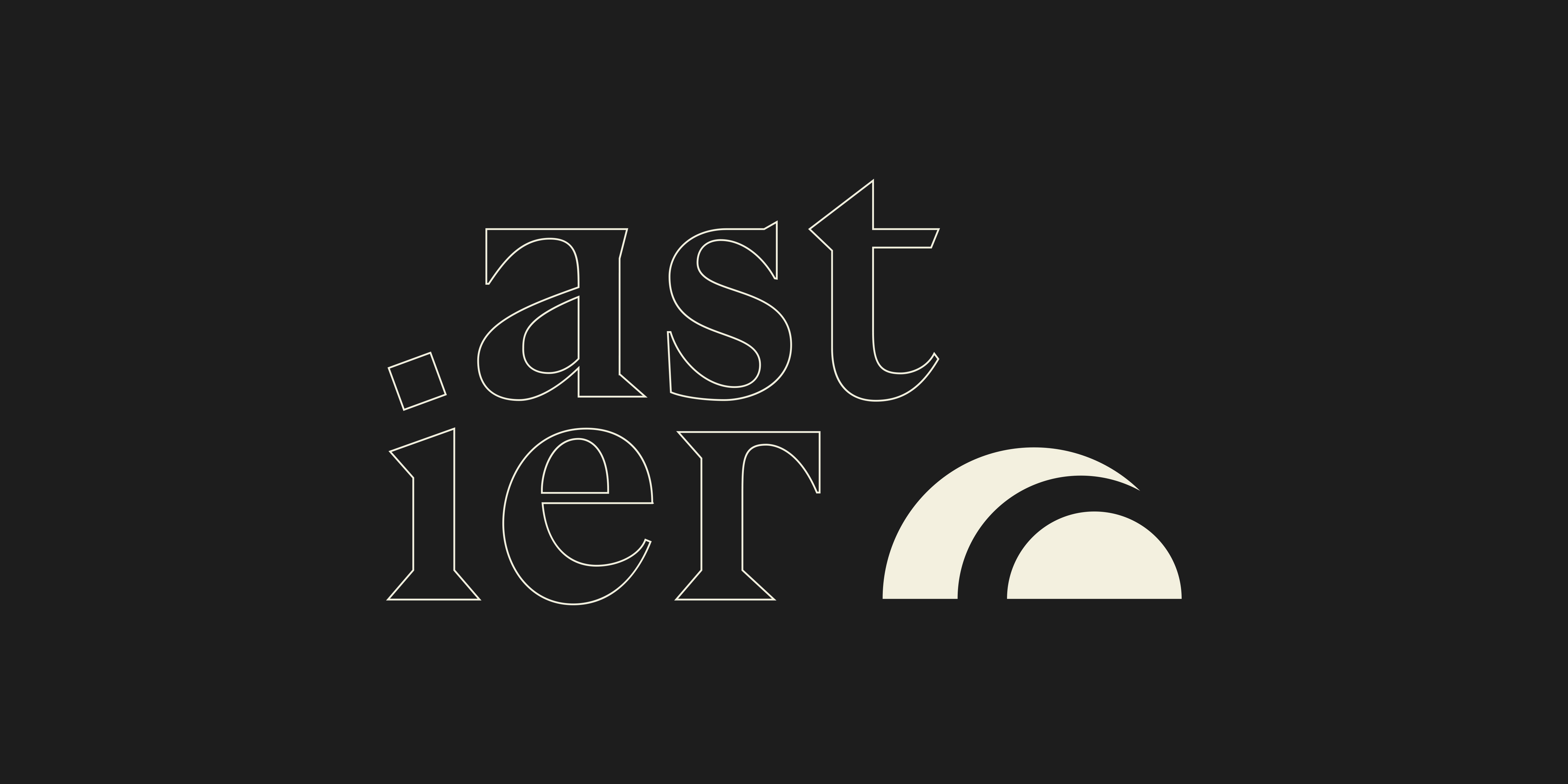
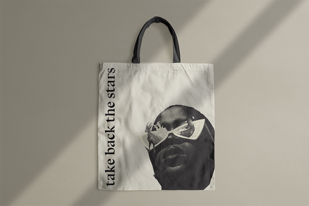
Astier is a trendy new company that focuses on the individuality of a person's astrological chart. It takes geometric features and unique collages to pay homage to the stars. This brand application is eye-catching and sophisticated, which sets it apart from the usual tarot aesthetic.
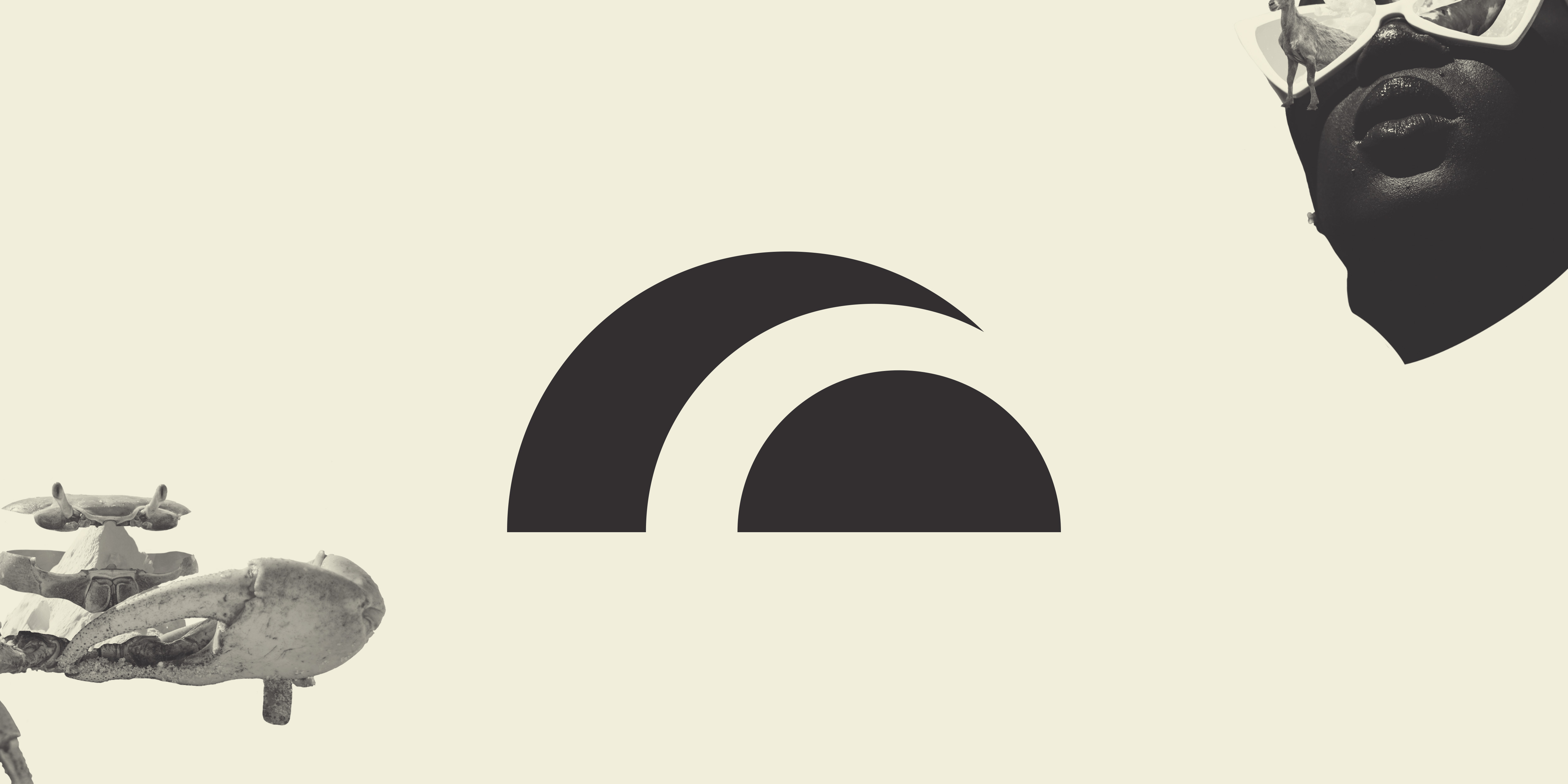

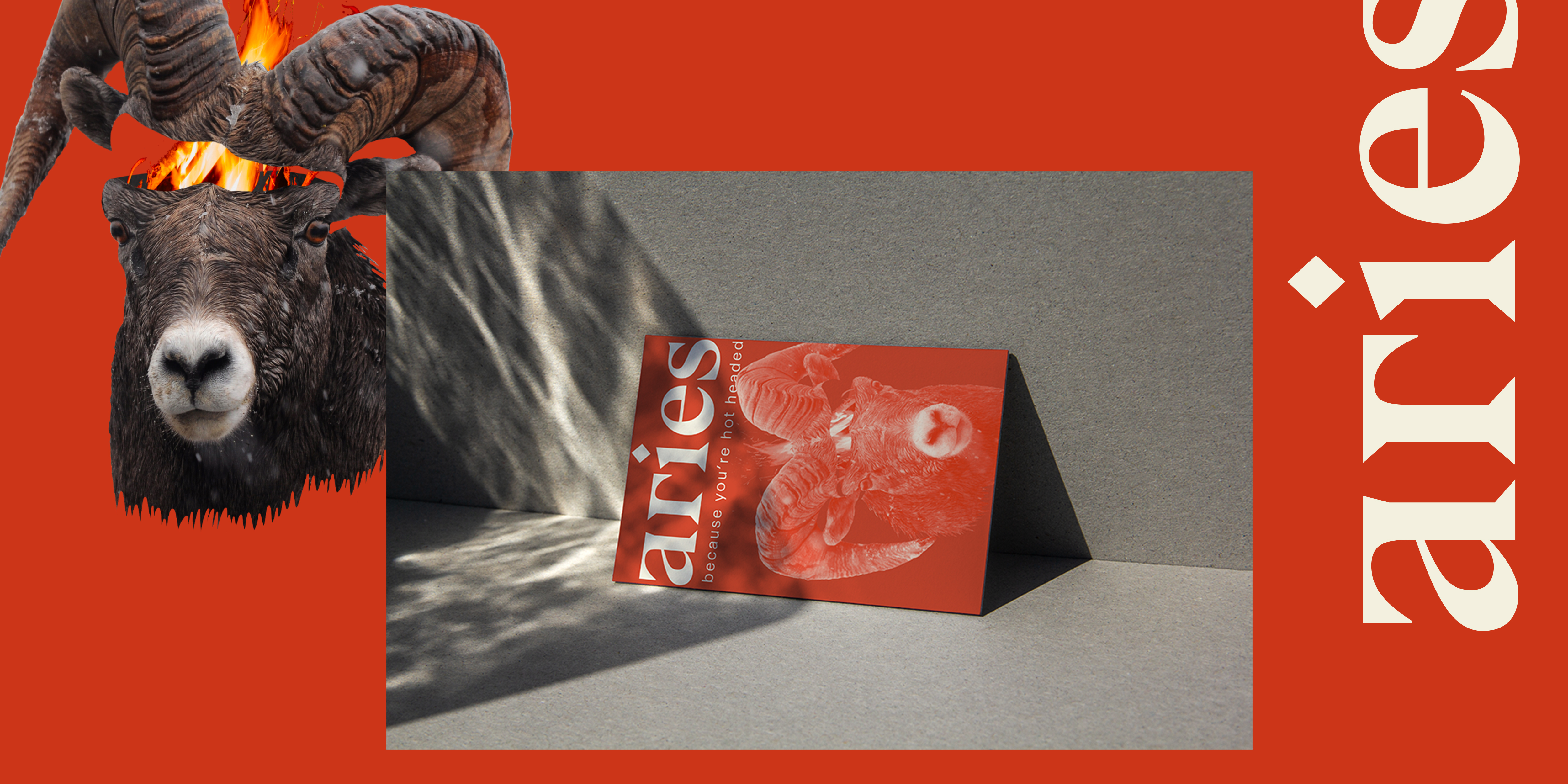
A significant amount of research went into the elements of this identity. Each zodiac symbol is commonly associated with a particular color, animal, and trait. One example is Aries (March 20 - April 19). The symbol for Aries is a ram. Being hot-headed is one of the common traits of Aries individuals, and the color most associated with the sign is red. These facts influence the hue, the collage, and any collateral for this sign.
The most work for this project went into creating packaging. As an online shop, Astier sells specific products that would help an individual with the adverse side effects of their sign. Examples that I have are wintergreen gum for Sagittarius, who is known never to have their mouth shut. This fun and creative element to the brand helps stretch creativity while not taking itself too seriously.
![]()


