body +
branding, illustration, packaging, photo direction/styling
Body + is a cosmetic company looking to empower individuals and show that all bodies deserve love and care. The brand emphasizes the importance of inclusion and fluidity in ones one body. Body + makes products and scents made for everybody and every body.


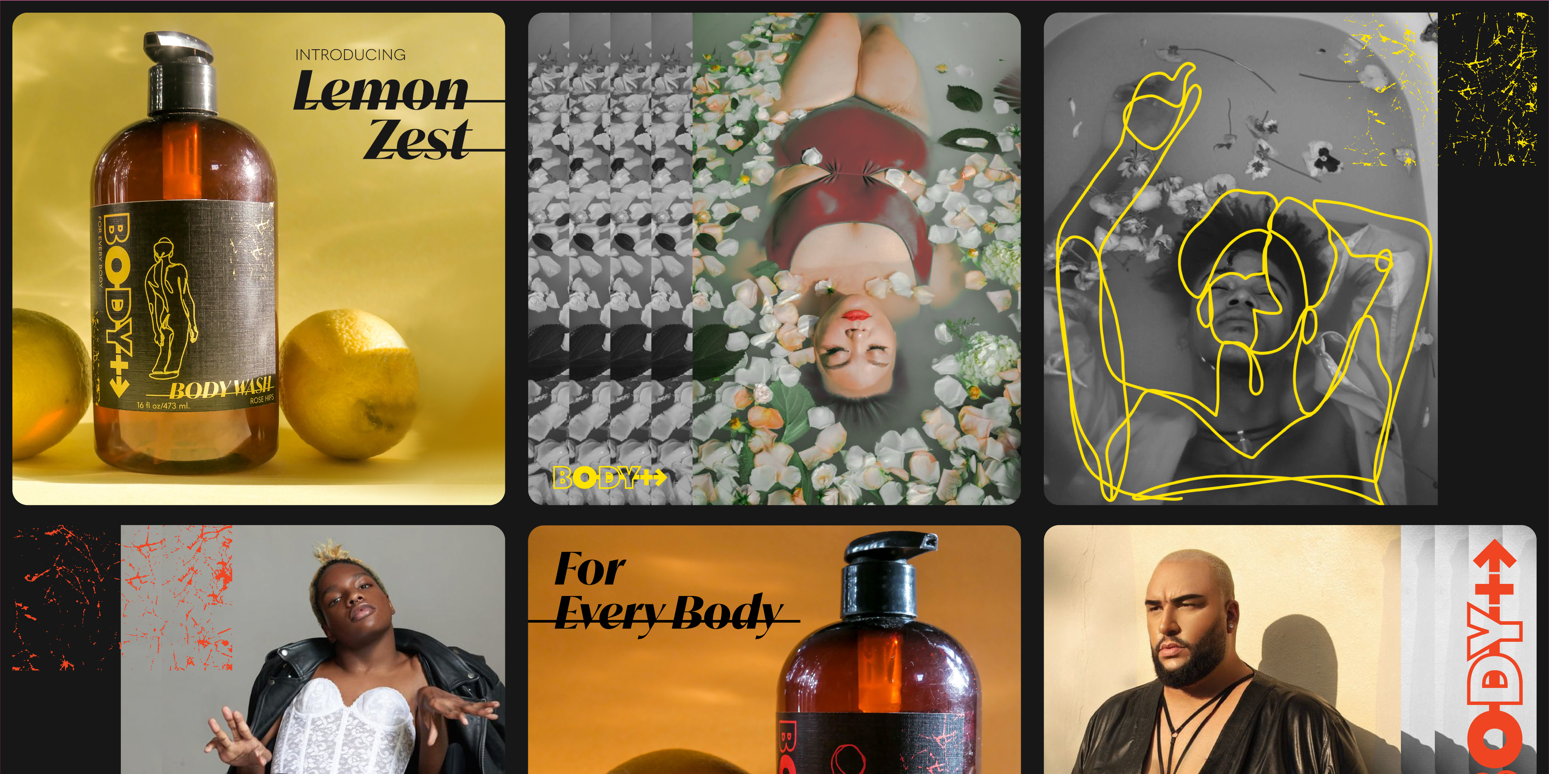
Art direction and photography highlight the packaging. Simple sets with attractive lighting allow the colors and illustrations to shine and draw the consumer to the product. The images stand out on social media and help the brand expands as more scents are added to the cosmetic line.
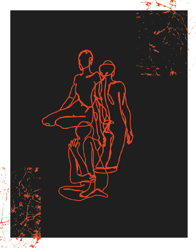
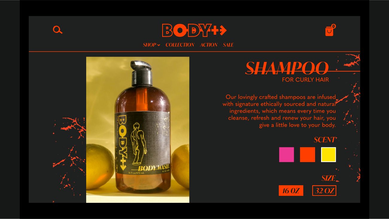
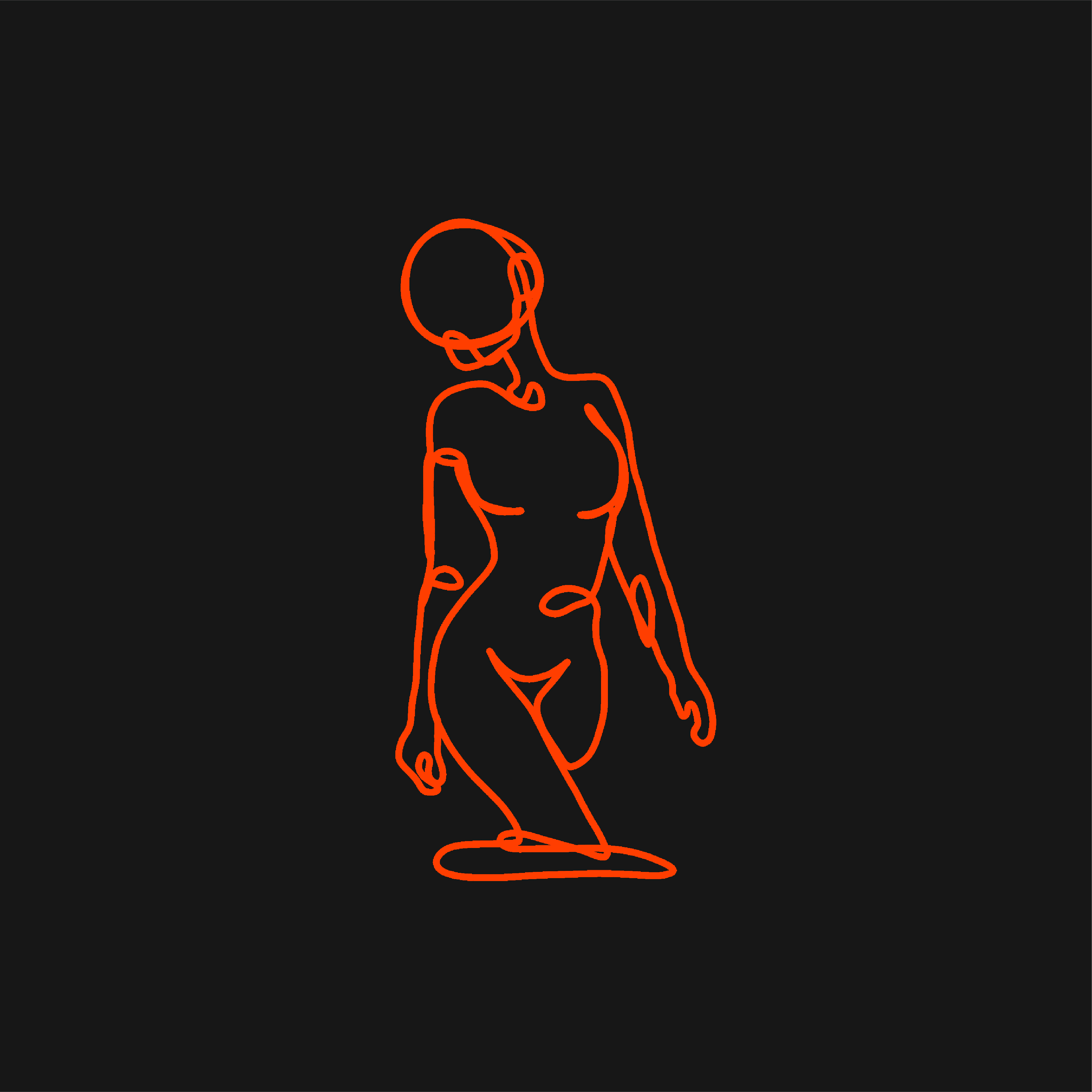
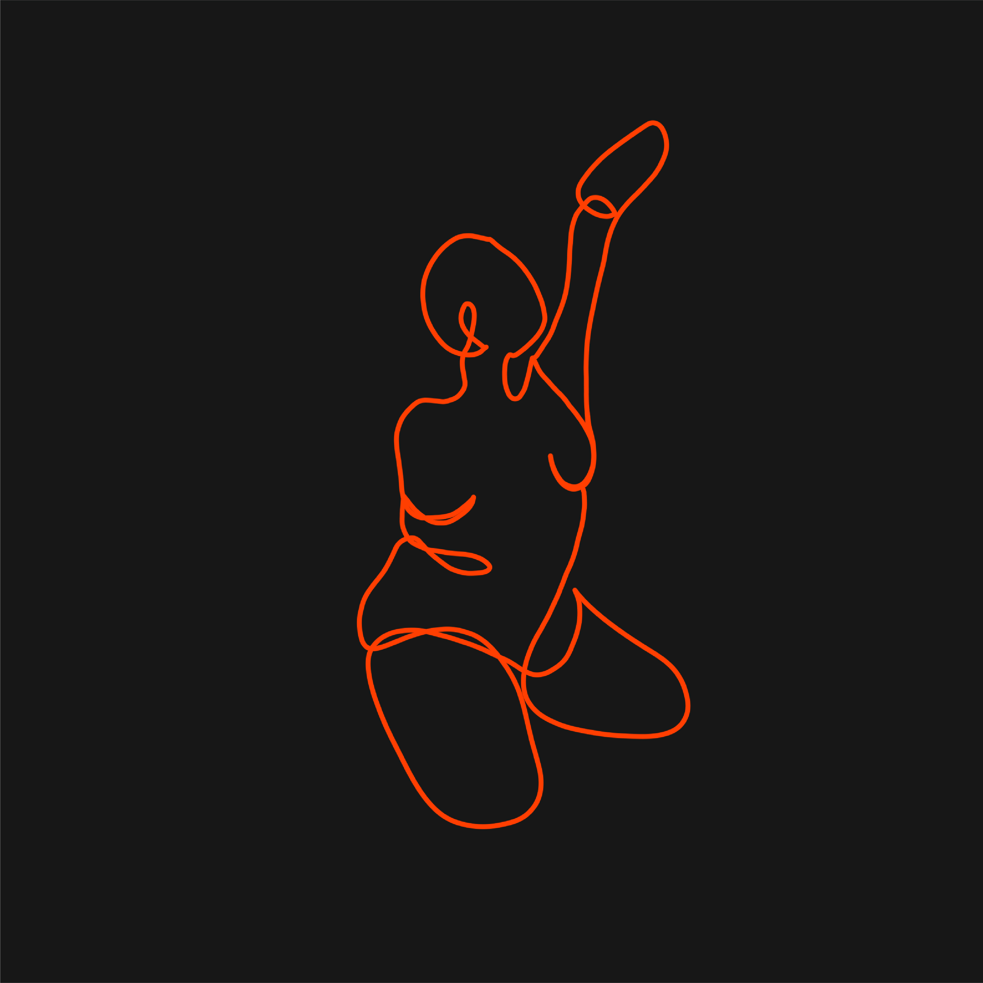
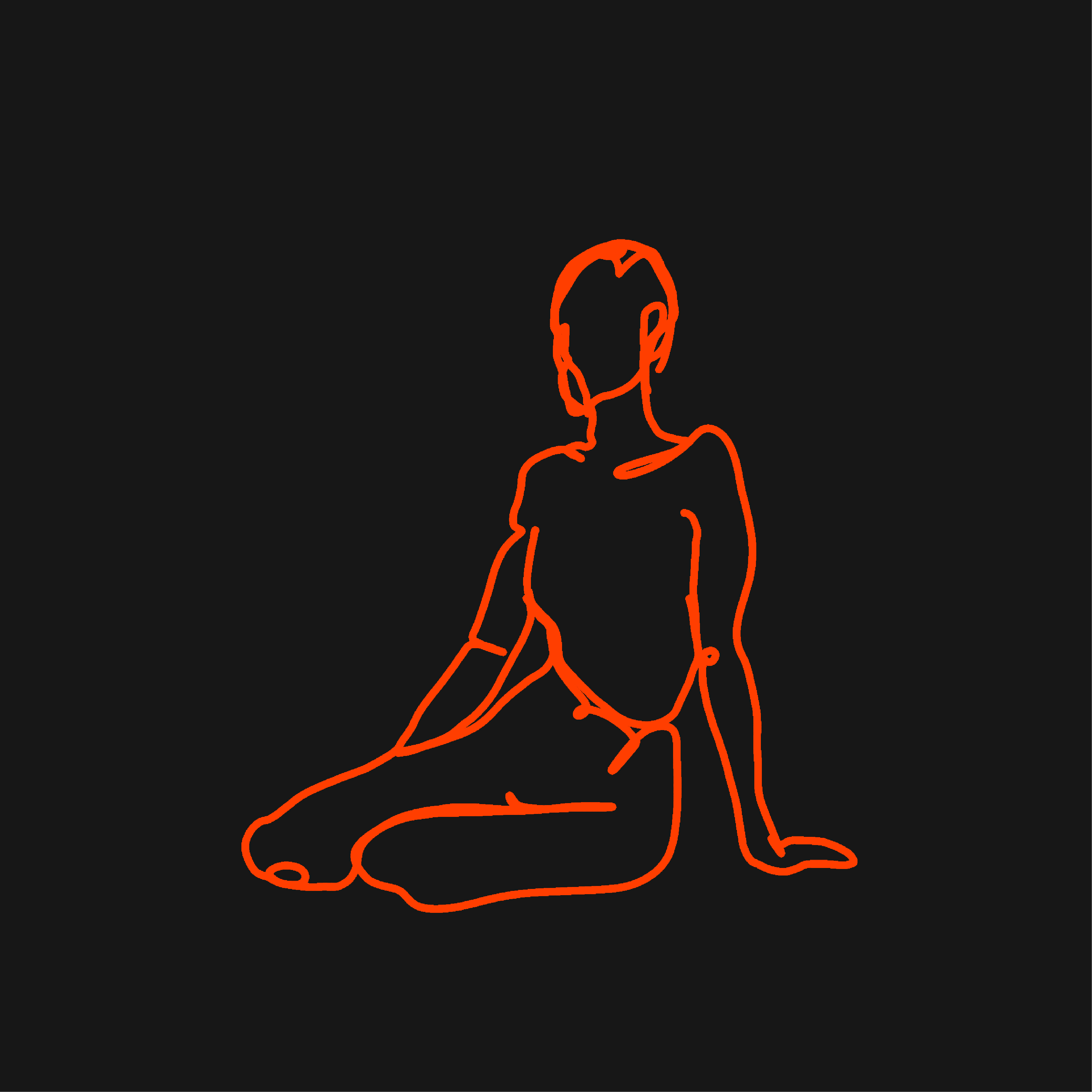
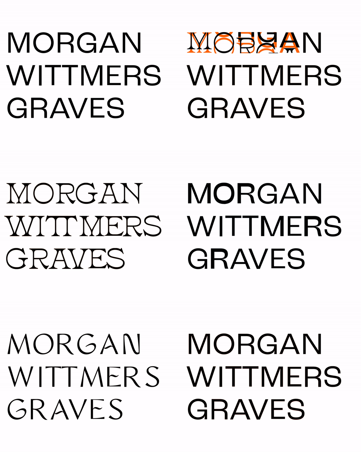
The brand is equal parts fierce and strong. A bold color palate and sharp typography bring energy into the design. The texture evokes punk design while adding interest and fun. The stand out for this packaging is the art. Fluid contour lines bring a softness and balance to the look. The illustrations promote inclusivity and can evolve to embody the brand's message.

