speak
identity, user experience, user interface
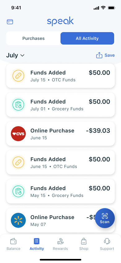
Speak is a fintech company dedicated to delivering a user experience that helps the average person achieve physical, mental, and financial wellness. The app allows users to manage their account balances for government assistance and track spending habits. The rewards program promotes healthy choices with the incentive of product offerings and unique savings. The accessibility and ease of navigation are critical in this design to reach the broadest range of users.


Speak strives to be approachable and friendly. Gone are the sterile greys and greens seen in the financial industry. The bright colors and rounded shapes bring a playful atmosphere to the brand. Photography focuses on the success of people managing their health using Speak. Navigating the healthcare industry is now a manageable task.

This project was an introduction to User Experience for me. I used a real-life product to understand better what goes into designing an experience. The atomic design of this app started me from the most minor decision to color and text size and built up to the creation of more significant elements. I could finally see the puzzle pieces creating a cohesive workflow.

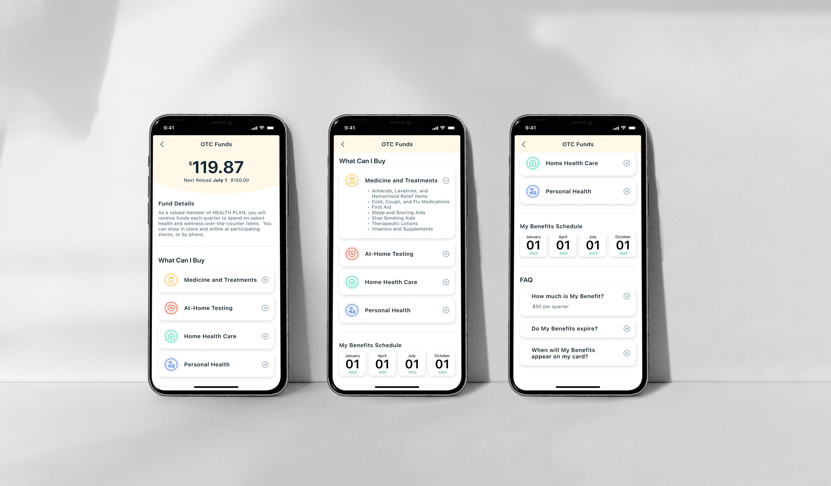




I took it upon myself to look into the accessibility of this brand. I worked with my team to create the foundational brand of Speak. The client wanted bright colors to stand out from competitors. This choice sparked a problem with the final five colors not meeting WCAG guidelines when contrasted with white. I expanded the color choices, allowing for a broader range of uses when it comes to text and background colors. Accessibility is vital for the user base that would realistically use this product.

